Uvesco Group & Kendu
Award-winning visual identity store design
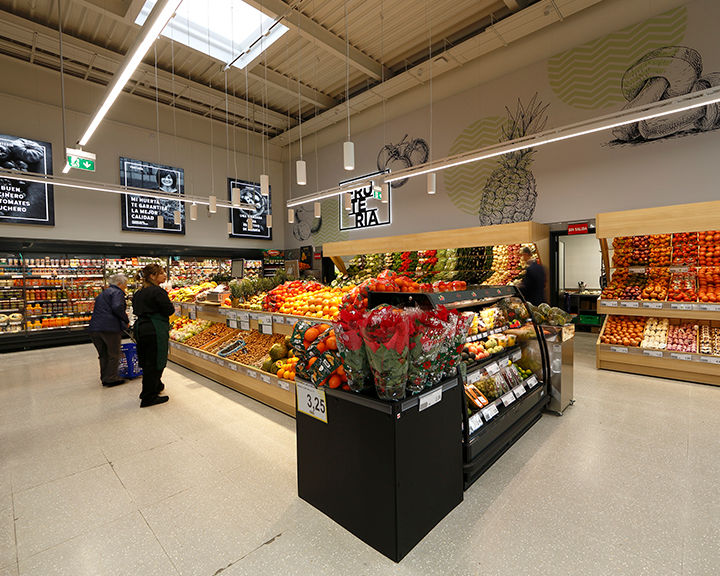
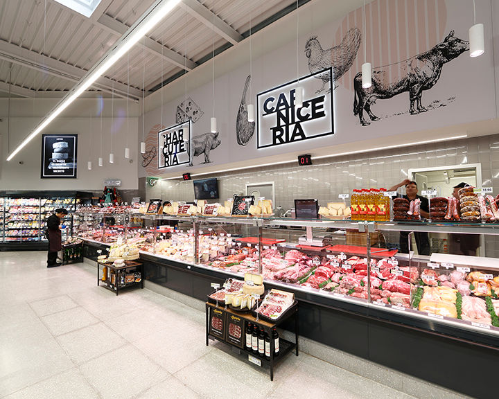
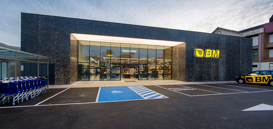
Grupo Uvesco, founded in 1993, is the market leader of food distribution in Northern Spain. With over 220 supermarkets across Northern and Central Spain, the company wanted to develop a new store concept for their BM Supermercados with the aim of offering a point of difference for their customer base of more than 400,000 people. From the materials used for the façade to those used for the store’s fixtures and furniture, from the display systems to the visual identity, from the signage to the spatial distribution, all were given a design overhaul. Grupo Uvesco had clear objective for the new store concept including developing a minimalist look and feel, integrating wall and fixtures into the wayfaring, creating an open-plan space and highlighting strategic areas such as fresh food and the wine cellar. The company worked with Kendu, their trusted partner for over 15 years, to launch the concept in their new supermarket in Renedo, Cantabria.
The Solution
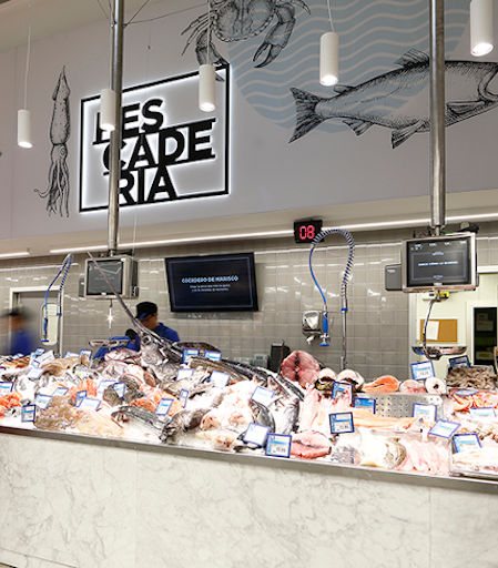
Working closely with Uvesco, our in-house Graphic Design Department designed a new visual identity for the supermarket including the logo, graphics, wayfaring and branding for the store’s interior and exterior signage. For the fresh food section, Smartframe large-format displays, up to 6 metres long, featured a minimalist rectilinear design combined with hand drawn illustrations in muted colour tones. Customised methacrylate signboards, illuminated from the inside out with LED lighting, were used to display each section’s name.
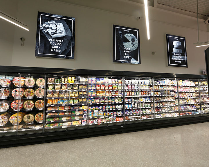
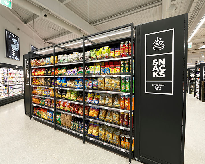
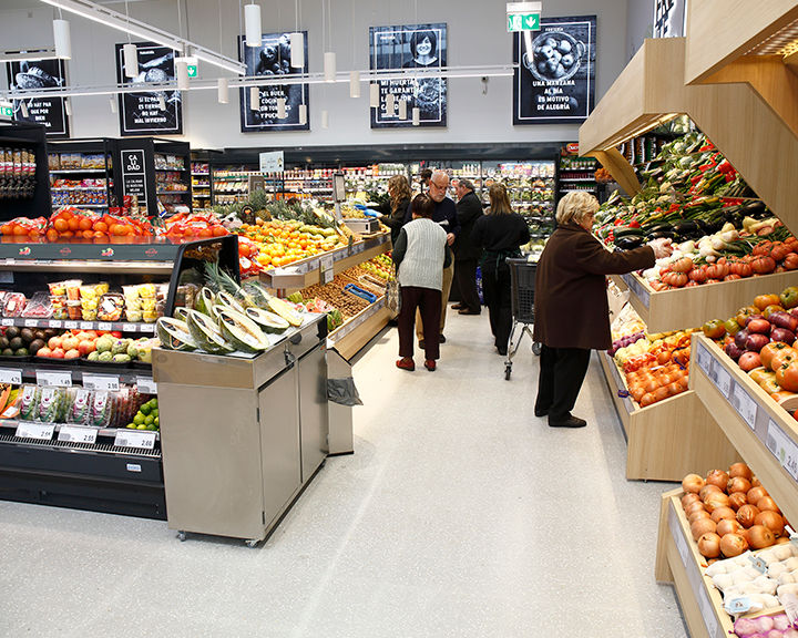
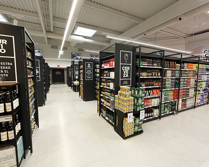
The store walls, featuring over 15 Smartframe LED fabric lightboxes, are integrated into the wayfaring signage and maintain the same black and white monochrome, rectilinear visual identity. Showcasing black and white photos of market produce, they signage includes playful messages such as “don’t worry, brie happy” and “there isn’t anything ice-cream can’t fix”. Similarly, the gondola signage features pictograms, designed by our team, accompanied by a light-hearted message such as “the very best for your best friend” and “beauty is on the inside”. On the opposite end of each gondola, one of the ten brand pillars is featured.
The store won the categories of “Food/Beverage & Supermarket Design” and “Graphics – Signage and Wayfaring” in the 2019 Creative Retail Awards.
