Product display and visual communication solutions
Sports showroom
Giant was created in 1972 with the aim of becoming the leading brand for cycling fans. Through skill, innovation and inspiration, the brand wants everyone to enter into the world of cycling by creating high-quality, affordable materials.
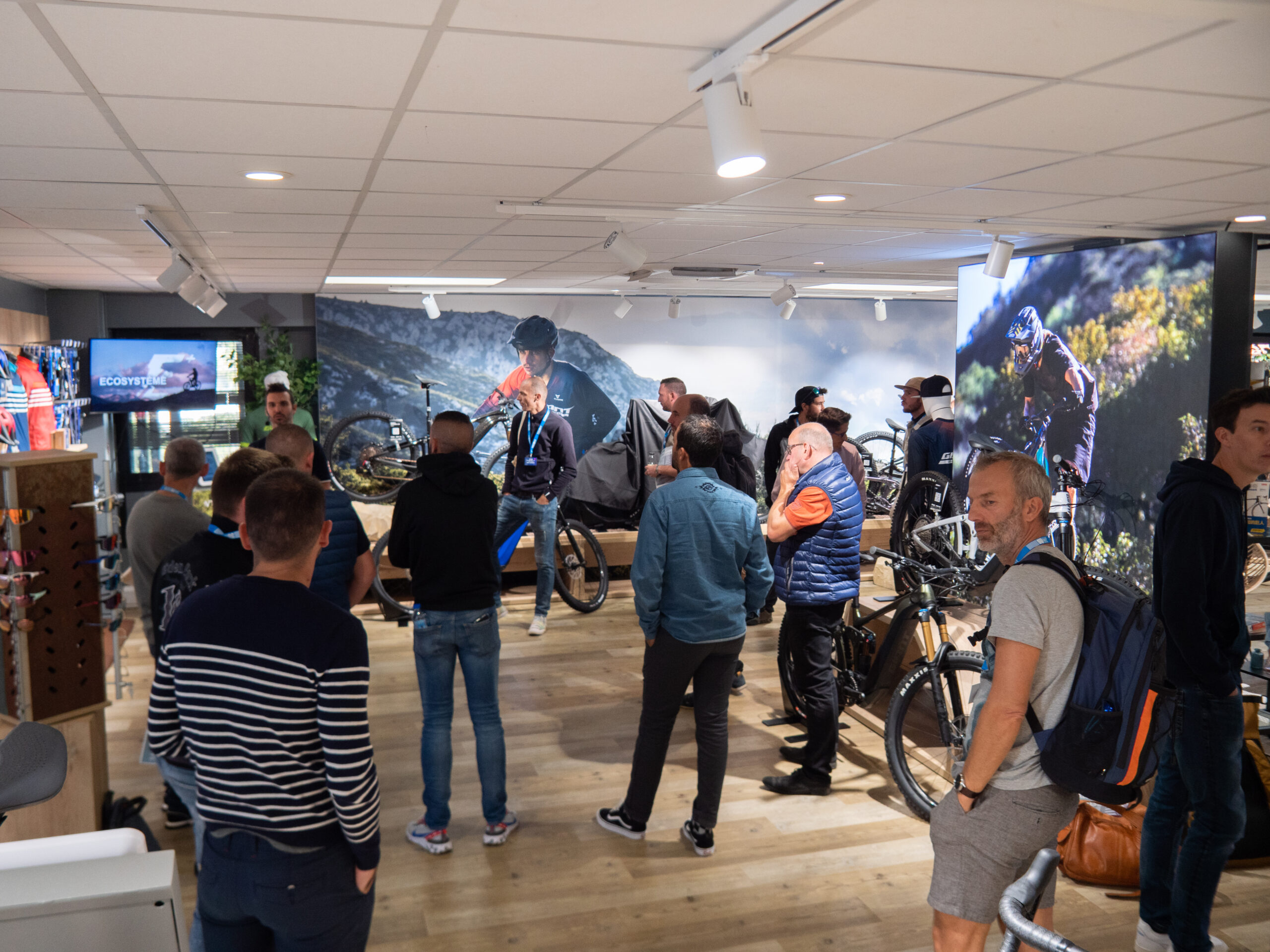
The sports company strived to achieve a wow effect when it came to refurbishing its showroom. The space needed to achieve two objectives: to feel like a relaxing meeting space and to showcase its products effectively.
The Solution
Kendu strategically studied the space to make a proposal that would get the most out of its showroom. Through the use of visual communication elements adapted to the space, the showroom had to achieve their aim of effectively displaying the products, in addition to creating a multidisciplinary space.
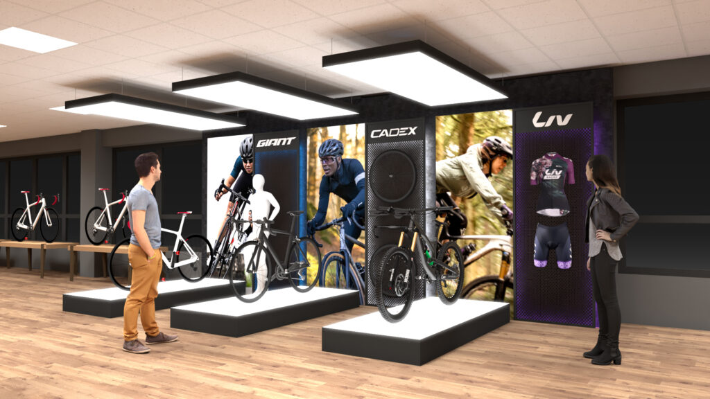
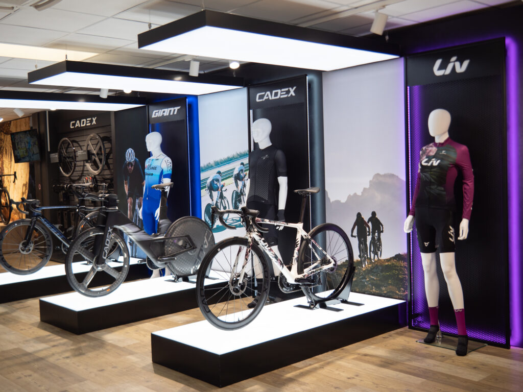
To display the products, Kendu and Giant worked together on a solution that would highlight the three top cycling brands sold by the company: Giant, Cadex and Liv.
When it came to displaying and showcasing the bicycles, they designed six lightboxes, with three of them being fixed to the ceiling and the other three to the floor. As a result of this combination, they created a podium effect that highlights and illuminates the products.
This area was also fitted out with the three existing windows covered by our graphic frames. As a result, the perfect aesthetic solution has been integrated to achieve three distinctive spaces for its three product ranges.
Besides that, the showroom had a second area that could not be overlooked which was the lounge area. A meeting and chill out space that needed to feel warm and inviting but also modern. When it came to designing the space, Giant had to deal with a shortcoming: a column right in the middle that could not be taken away. As a result, Kendu’s creative team adapted their suggestions to the structure.
Given furnishings were already available in the space, a decision was made to integrate them into Kendu’s visual communication solutions. The main idea was to present a brief recap of the history of cycling in an immersive way, by showing various milestones such as the Tour de France and a display of books dedicated to the topic.
In order to create an enclosed space, various graphic frames with different geometric shapes and textile printing were chosen. For the column, a lightbox was designed featuring two fixed metallic structures that created an environment resembling a library.
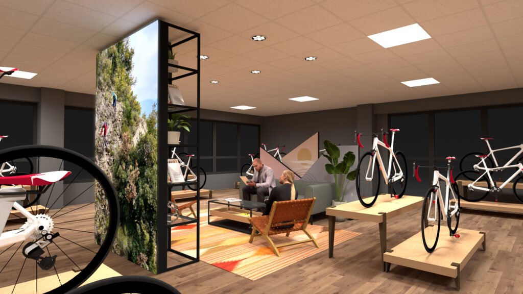
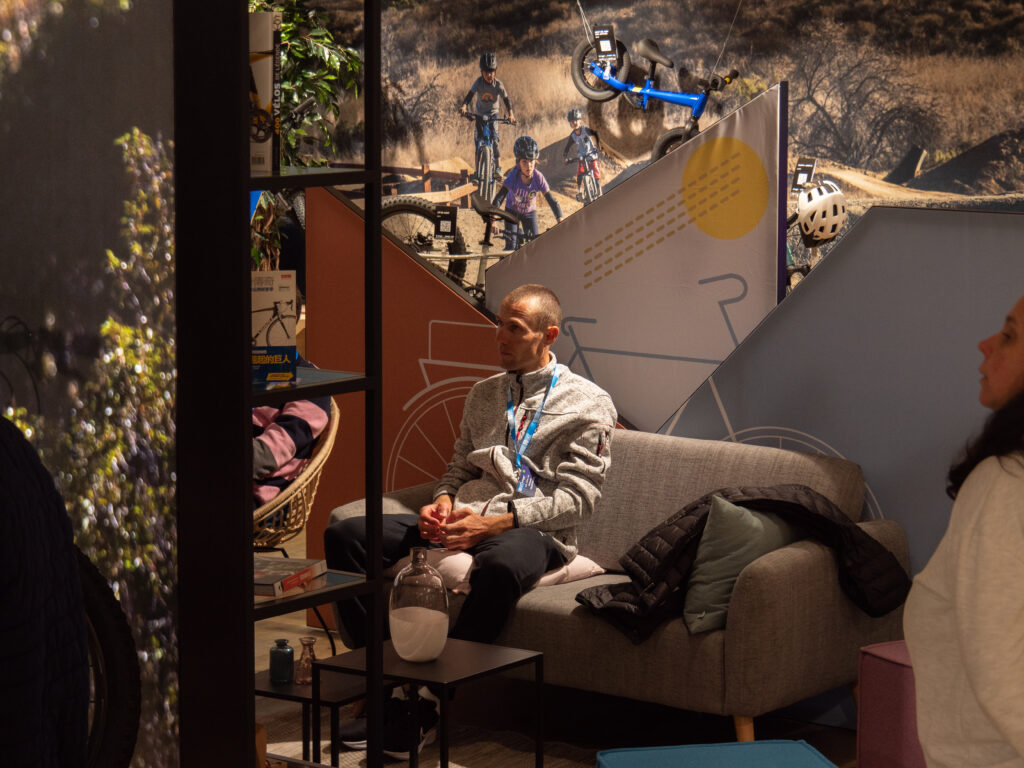
To sum up, this was a large-scale custom project that managed to refurbish the available space in order to display the brand’s products while adapting to the architectural features of the space.
