Macy’s & Kendu
Bespoke solutions for America’s leading department store
Macy’s, one of the world’s largest chains of department stores, required to maximise the use of existing structural elements in their stores in order to highlight visual communication surfaces and increase product display areas while maintaining the basis of their concept: open spaces. A common challenge among these types of stores also needed to be analysed: which formula should be used to make the look & feel of multi brand beauty areas consistent and easy to manage?
The Solution
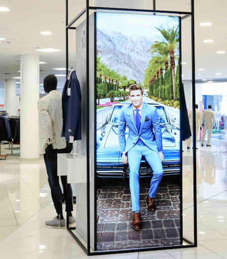
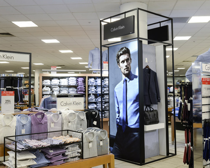
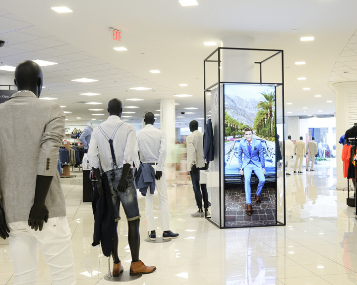
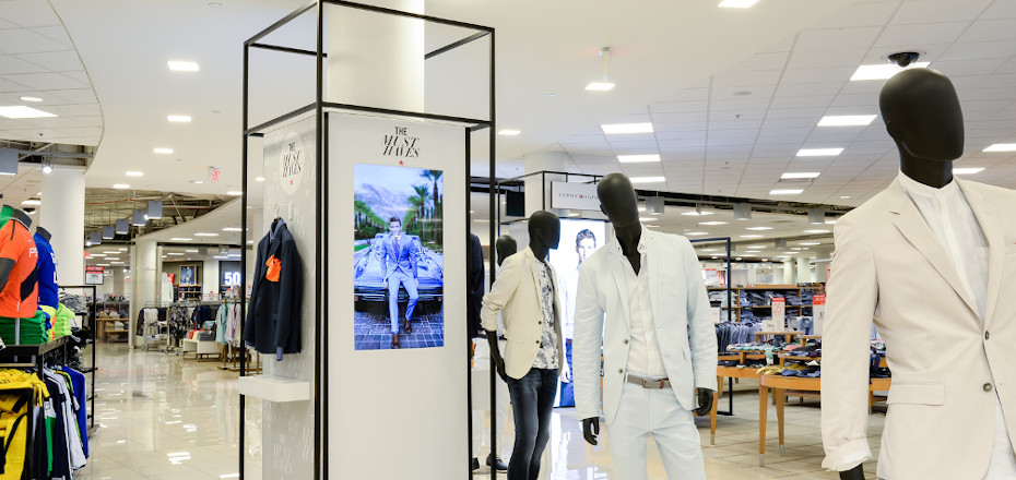
After analyzing each challenge in depth, Kendu’s proposal includes a customized self-standing metal structure to surround the columns within the store. Creating a solution that maximizes the space to display products and communicate messages at the same time. Magnetic shelves provided the versatility needed, allowing each corner to have a different lay-out whilst using the same structure. To standardize the multibrand area, we created a self-standing structure with printed textiles based on the Smartframe easily changeable system. This combined with a custom range of accessories like acrylics and magnetics, allows each brand to organize the beauty pop-up specifically for their needs.
To an astonishing “mise en scène”, Kendu ads an extra value by integrating digital signage within the column structures, which thanks to in-store analytics technology, provides each brand with customer traffic data. Macy’s has also gained better control of the use of space and increased revenue from brands by managing the campaign visual replacements in their beauty area on their behalf.
